In a comment on my post on growing my niche affiliate site Dom asked: –
Is there an optimal layout for product review pages and blog post pages to improve conversions which you could recommend or have as a template?
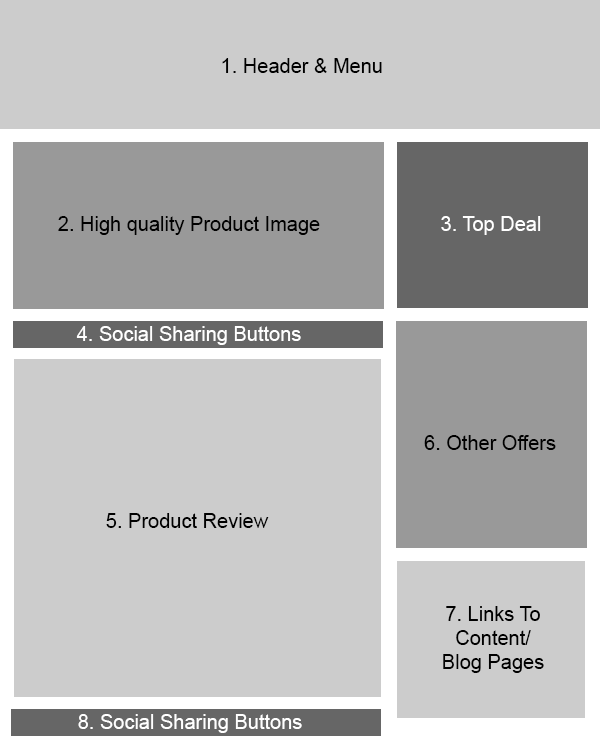
I thought this would be a good one to put into a post of its own, so below I will share with you the layout I have found converts best for this particular model of affiliate site (review + price comparison) and explain a little bit about each of the sections.
Firstly, here’s the layout!

Now let me go into a little bit of detail about each section.
1. Header & Menu
Ok, not too much to say here really. It stands to reason that your header will be at the top, but a few pointers: –
- Make sure your branding is strong
- Make sure it is clear what your site offers
- Don’t go overboard on links in the menu (try and direct visitors to your popular products/pages)
2. High Quality Product Image
A picture tells a thousand words, so put a nice big high quality product image right at the top of your page.
We are visual creatures and a product image above the fold will tell a visitor they are in the right place (reinforcing your header).
For added impact you might want to have a jquery image carousel here, rotating through different angles etc.
3. Top Deal
If you have a price comparison model, then most of your visitors will be looking for the best deal on the product. So give it to them in a nice big box of its own above the fold!
Note, I say ‘best deal’ for a reason as this might not always be the cheapest price. Their might be additional extras included (free delivery etc), so put a bit of text explaining why it is the best deal.
You can also look at charging merchants a premium for being featured in this box 🙂
4. Social Sharing Buttons
Getting people liking/sharing your pages will bring visitors directly from social media and over time help to improve your organic search traffic (social signals).
So make it easy for people to share your content!
5. Product Review
I went into detail in my previous post about why it is important to make your review the best one out there for the product you are promoting, so here are a few additional SEO pointers.
- Product name in H1 tag at top of review
- Write naturally and you will use lots of long tail phrases (which as I explained yesterday is where the real traffic is)
- Link contextually to related products/pages on your site
- Minimum length of 600 words, but ideally longer
6. Other Offers
Affiliate links to other deals for the product, normally ordered by price (low to high).
7. Links To Content/Blog Pages
The key to success with a niche site is creating a valuable resource, the ultimate authority for the product(s), so provide some links to your high quality content pages (buying guide etc) which will assist a visitor in making a purchase/choosing a model.
8. More Social Media Buttons
Double up on the social media buttons and put them at the bottom of your content too. After all, if someone has read that far they will be likely to share.
You might also want to put another ‘top deal’ box down here.
General Notes
I have found that a 2 column layout with content on the left and affiliate links on the right works best for both conversion and SEO.
One of the main reasons is that it pushes all your affiliate links below the main content (in the html), however it means your ‘top deal’ box will be above the fold (in the browser).
There is a common misconception that google doesn’t like affiliate sites, but that is not the case at all. The problem is where affiliate links/advertising dominate the page to the detriment of content and this layout ensures that the important stuff (as far as google is concerned) comes first.
Important: You should always add the nofollow attribute to affiliate links as they are technically a form of paid link and should not pass pagerank.
You might also want to put them through a redirect (i.e. yoursite/merchant/product) to make the urls look a little neater.
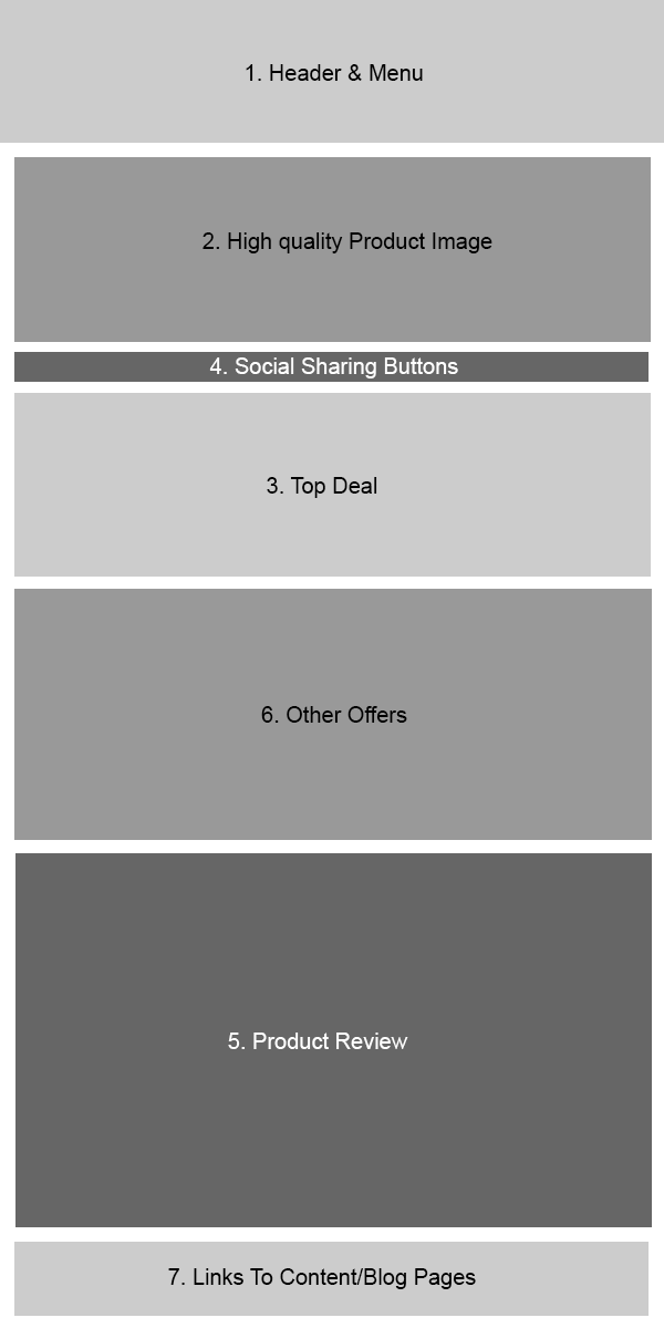
Mobile Version
I’m a big advocate of responsive design and if possible your layout should adapt to different browsers.
For mobile I recommend a single column layout and have found the following has the best conversion (I have kept the numbering the same).

Always Do Your Own Testing!
Hopefully the above has given you some ideas for laying out your content to maximise conversions on your affiliate pages, however…
You should always conduct your own split testing/tweaking as, while this layout will work for most niches, you may find a better format for certain product categories/topics.
There might also be other sections that you want to include in your layout.
So test, test and test some more!
If you have any questions then please leave a comment below or drop me an email and be sure to subscribe for loads more SEO and affiliate marketing tips!